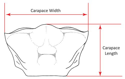
This is a general guide to the data and figures on fiddler crab size on the site. At this time size is presented as carapace width (or breadth). This is either measured as the maximum breadth of the carapace or the distance between the tips of the antero-lateral angles; usually (although not always) these are the same thing, although the difference is always minor when there is one. All measurements are presented in millimeters (mm).

For each species, the bottom part of its size page lists all of the data values, including source. In some cases data was extracted from figues (should be indicated in the notes). The data for each species can also be downloaded as a tab-separated text document. The top of each page begins with a graphical illustration of all of the data, including a summary figure which integrates all of the data into a single estimated distribution. Different types of data are displayed in a different manner in the figures, and are described below.
As a general rule, data are added to the figure from the bottom up. Blue data points and images refer to male data, red refers to female data, and black refers to mixed/combined/sex-unspecified data. Male data and female data are always plotted separately, except when combined into the summary distribution (black) at the top of each figure.
Individuals
The most sraight-forward data are direct measurements of individuals. These are graphically displayed as round points at the bottom of each figure. The vertical shifting of the points is meaningless, arbitrary noise used to help better display the density of similar measurements.

Ranges
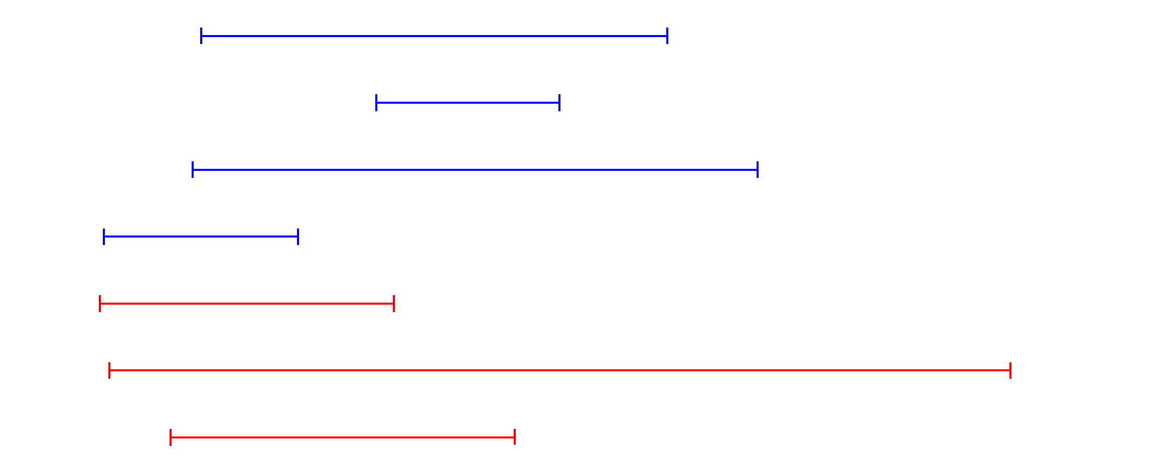
Range data represents the largest and smallest values for a group of individuals, including sample size when available. When unavailable, the sample size was assumed to be 2 as this is the miniumm number necessary to create a range. Ranges are drawn as horizontal lines with vertical endcaps representing the minimum and maximum widths. Each range is drawn separately; sample size is not indicated on the graph (but is in the data table).

Means
Means represent average sizes of a sample. Reported means may include sample size, standard deviation, standard error, and even minimum and maximum values. Sometimes they include none of these (in which case the sample size is assumed to be 1, i.e., equivalent to an individual. Each combination of data reporting is listed in a separate data table. Visually, means are drawn on the figure as diamonds, each on it's own line. A 95% confidence interval is included when an SD or SE is available. If both SD and min/max are available, the figure includes both a thicker line indicating the 95% CI and a thinner line with vertical endcaps indicating the maximum and minimum values.

Histograms
Occasionally a size distribution is available as a histogram. In this case, the data is presented as the min and max of each histogram bar and the sample size (height) of the bar. Bars for the same histogram are labeled in the data by a unique set name. Histograms are drawn on the figure as standard histograms, except that each unique histogram is scaled to the identical maximum height, thus the drawn histograms can be used for general distribution comparison but do not indicate the case where one may be based on a much larger sample than another (all sample sizes are part of the data table).

Summary Distributions
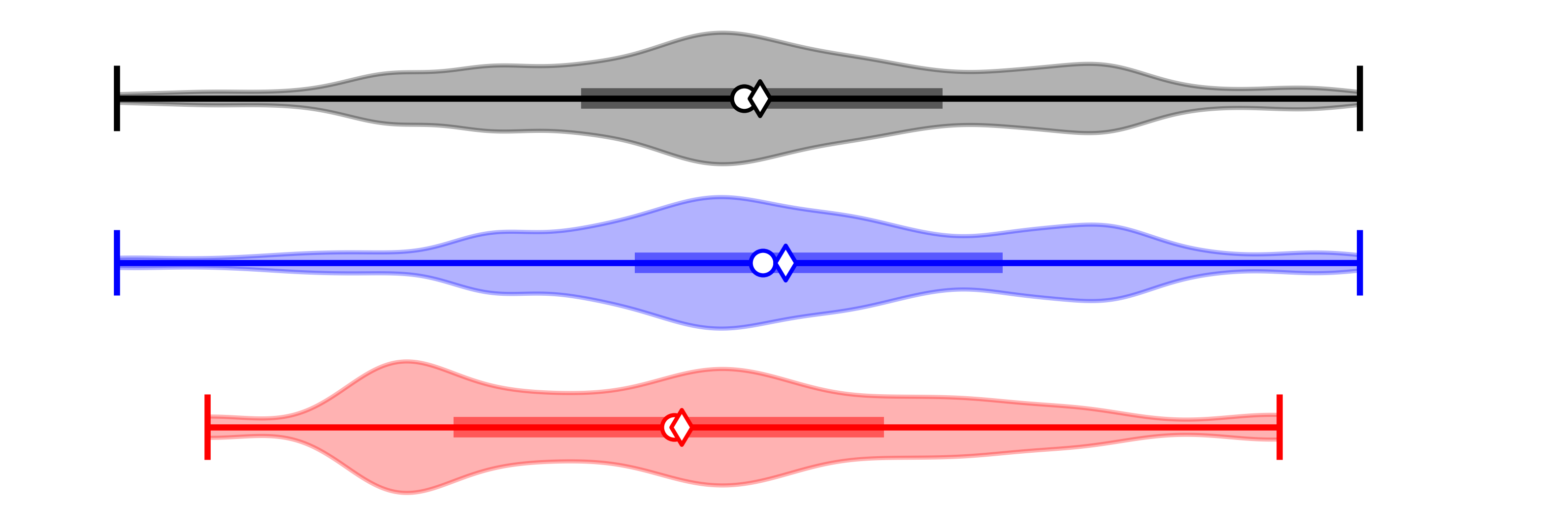
The summary distributions are calculated for males and females independently, as well as combined (the top figure in black). These distributions are created through a simulated integration across all of the data for that species. The simulation creates a large “data set” of individual measurements from all of the distinct data sets and types. The data set with the largest sample size is scaled to provide 1,000 values to our simulated data set. All other data sets provide values proportionally (e.g., if the largest data set has n=50, that data set will provide 1,000 values, while one with an n=10 would provide 200). (In the unlikely event that the largest observed data set has n > 1,000, the algorithm automatically rescales the largest sample by orders of magnitude until it exceeds the largest n). Data values are “simulated” based on each data set depending on the type of data. Individual measures, which definitionally have n=1, are added directly to the simulated set in numbers proportional to the largest sample. Frequency histograms are also directly added to the simulated set with the midpoint of each bin representing the value added and the total count of the bin representing the n to scale to the largest sample. For measures represented by means with an estimate of variance; values are simulated from a normal distribution (with expected mean and variance). If a mean is reported without a variance, it is treated as if the variance were zero; this has the obvious potential to give too much weight to that estimate, but generally these have very small sample sizes so the effect appears to be minor.
Range data is the most complicated part of the simulation. First, the end points of the range are added as if they were individual measures. If the sample size of the range is greater than two, then the remaining samples (after those representing the endpoints are accounted for) are drawn from a restricted normal distribution whose mean is represented by the midpoint of the range and whose standard deviation is estimated as the width of the range divided by four (the “range rule of thumb”). The restriction is that only simulated values that fall within the reported range are accepted.
All of these simulated data points from all of these data types are combined together into one overall set. From this set, 1,000 values are then randomly subsampled to estimate the overall distribution, mean, median, etc.
The simulated summary results are shown by the violin graphs at the tops of each figure. These reveal a lot of information. Each of these graphs show the full range of the distribution, a density estimate of sizes (based on the colored, curvy background), the mean (diamond), median (circle), and quartile (thick center line).
